If you currently live in or have experienced living in a studio apartment you know what it means to work with what you’ve got. Transforming a single room into a livable space that acts as a bedroom, living room, kitchen, office and more is no small task, and doing it alone can be a very arduous process. That’s why we’ve reached out to the experts in studio design from Miami to Portland, to offer their insights on how you can make your studio apartment as livable as possible without sacrificing aesthetic. So if you’re moving into your first studio or dorm room, follow these 20 tips to make the process as simple as possible.
Recognize the power of association
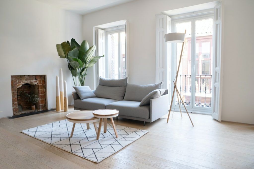
The power of association for humans cannot be understated, that’s why we recommend you organize your studio apartment around three main hubs of activity, each with access to an ample amount of natural light. First is where you sleep, make sure that your bed and resting area is neat and surrounded by only the essentials, keep your electronics away! Second is where you want to be productive; some may get more use out of this space than others, but everyone should have a space for taxes, bills, serious hobbies, etc. Put the power of productivity in your hands! Lastly have a place to relax, this is where you can watch TV, read, and generally unwind; having a designated space for each kind of activity will make it easier for your brain to tackle tasks with precision and intent. – Inhabitr
Efficiency is your friend
Studio apartment living is all about minimalism and efficiency. Storage beds are a great place to keep some clothing that can help you reduce the size of the dresser or armoire you buy. Keep your paint colors neutral or bright, as a dark color will make your space feel more confined. If you can, get some barstools for your counter to reduce the need for a table in the kitchen area. Above all, declutter at least once per quarter. You’d be amazed how much space can be created with a reduction in the knickknacks you allow to accumulate!
– Maureen Mcdermut Santa Barbara RE
Try to create some sense of division
My biggest tip for designing a studio apartment is to create division and designated spaces for sleeping, dining, cooking, and living. With one open space, it is so easy to see clutter and feel confined to a single box. Easy ways to create division in a space are to define zones with different area rugs, add dividing screens, create privacy walls with bookshelves that add storage, and even hanging curtain panels to create division.
– Design Dudes
Give attention to negative space
Ever heard of the saying ‘Less is more?’ This also holds true when styling your apartment. Refrain from pushing your furniture up against your walls and instead work on creating mini spaces within your room. (Tip: You can also use rugs to section off areas within the same space!) Also, avoid putting your furniture too close together. You want enough space between your furniture to help you easily and comfortably move around.
– Foerni Limited
No windows? No Problem!
There are many affordable lighting solutions for small or stuffy apartment spaces. These come in all shapes and sizes and can be standing lamps, LED lights and ambient lights that replicate the feeling of warm sunlight. These can be hidden or if they’re visually appealing, placed somewhere as a centerpiece. Most of these options can be bought in places like Amazon or other online retailers. – Big Spoon Co.
Think maximization
When designing your studio apartment, think maximization when it comes to furniture function and layout but think minimization when it comes to visual clutter. Use materials that don’t take up visual space like acrylic or glass. Hang one large impactful art piece or use peel and stick wallpaper to create a large accent feature instead of hanging a busy gallery wall. Even consider one cohesive paint color for your walls, built-ins, and cabinetry to avoid chopping up space visually (bonus: the room will appear larger!).
– Sidney Wagner Designs
Take advantage of multipurpose furniture
Make the most of every inch of floor space with multipurpose furniture pieces. A wall-mounted shelf with coat hooks adds a spot for displaying art and photographs while storing coats more efficiently in a small hallway. A Murphy desk provides a dedicated workspace when you need it, without crowding your living space when you don’t.
– NY State MLS
Studio Apartments are the ultimate in self-expression in a very limited square foot space. In order to feel as if the environment is larger than the actual footprint, several key strategies can be put in place to succeed. First, don’t overlook multi-functioning furnishings. These creative objects can provide several functioning purposes while taking up minimal space. A dining settee with a mid-height back can comfortably sit for evening meals and double up as a small sofa for binge-watching your favorite series on Netflix. Throw in a small cushion/ottoman for an impromptu meal guest and then use it to prop your feet up with the settee.
– Pu’uwai Design and Build
Having a murphy bed allows you to increase your usable space during the day for your hobbies and needs. A Murphy bed is a regular bed that can be folded up into the wall. This way, your studio can also be your home office or home gym. While Murphy beds are often expensive, companies like Lori Wall Beds offer a high-quality, inexpensive alternative certain to meet the needs of even the tightest budgets.
– Lori Wall Beds
Optimize your storage space
Installing frameless cabinets increases drawer storage space by 20%, compared to framed models. Also make sure to fully utilize cabinet drawer space by using a tiered cutlery divider for utensils such as forks, spoons and knives.
– Brad Iseri, Senior Kitchen and Bath Designer, HPM Building Supply
Add an artistic touch
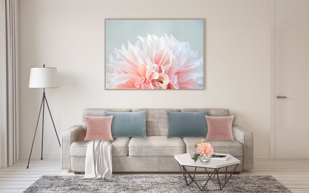
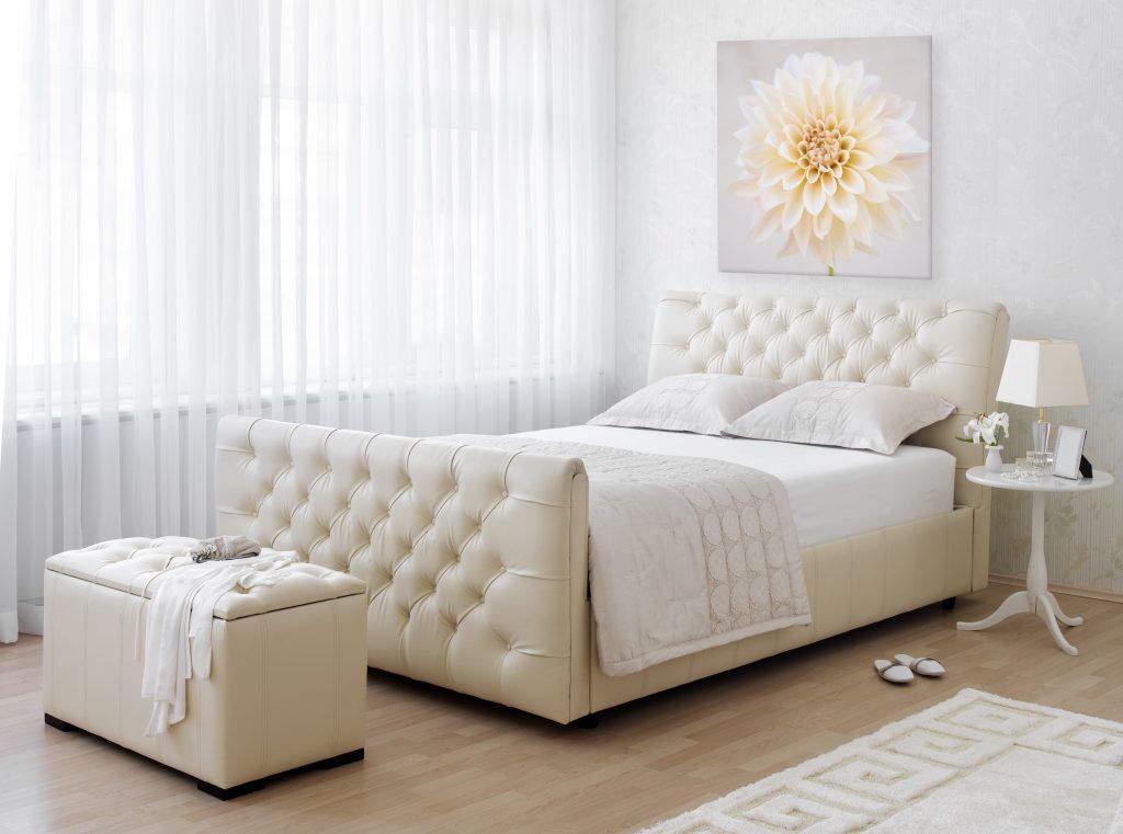
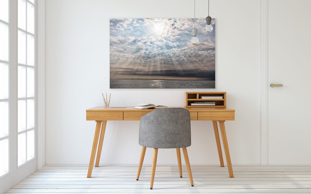
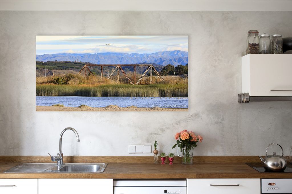
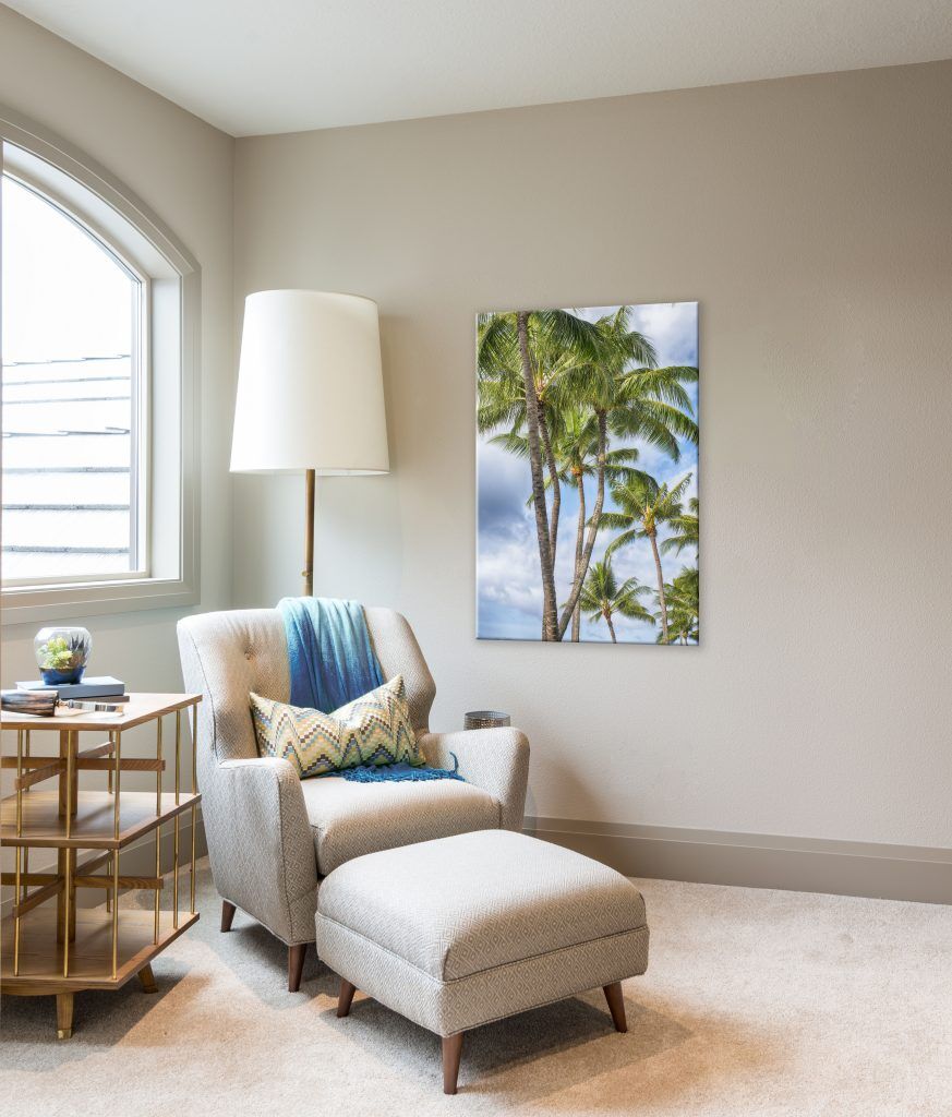
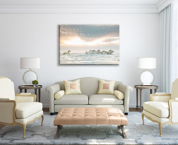
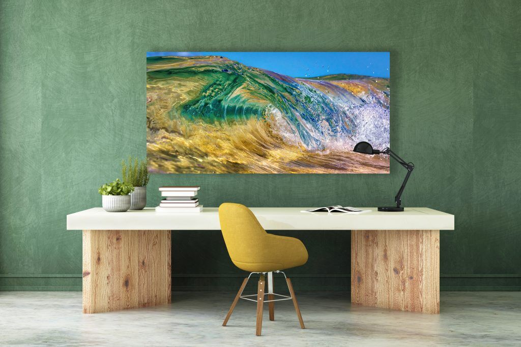
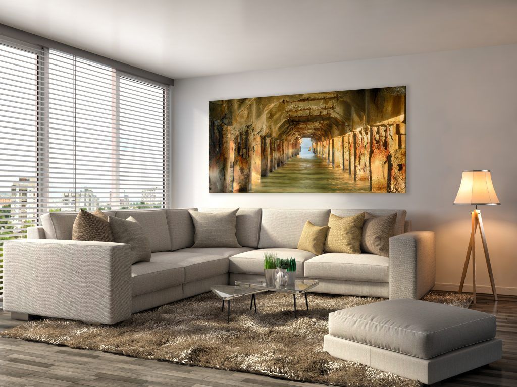
One of the easiest ways to transform your space is with art on your wall. It sets the tone for the entire space and can evoke any mood you like; from bright and playful to calm or dramatic. The right art can brighten your mood and uplift your spirits when you walk in the room and has a unique power to transport you anywhere…and don’t be afraid to go big when it comes to size! – Latitudes Gallery, Ventura
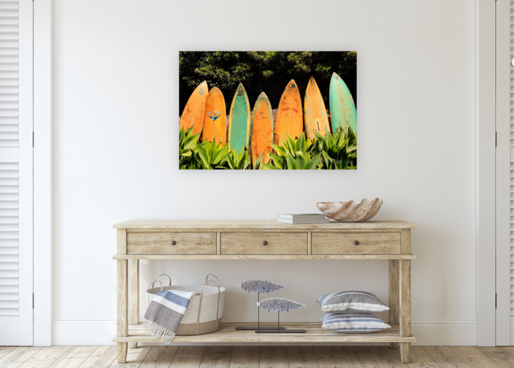
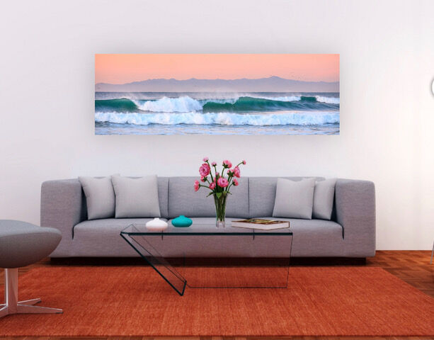
One of the quickest and the most unique ways to transform your studio apartment is by using art to create an illusion of a bright open space. There are artists, like myself who will work with you on creating a new vision for your space using a variety of materials; canvas, paintings, wall sculptures, murals, fabrics, acrylic, metal, or wood. The style of the art can be Modern, Bohemian, Traditional, Scandinavian, Shabby Chic, Hollywood Glam, or Rustic with the composition and concept of the art creating a more airy and bright space. Live the dream you envision with art.
– Robin Maria Pedrero
Decide on a focal point
A well-staged room has a singular defined purpose and a focal point. Buyers scan a room from left to right when entering, much like we read a book. If you place the tallest piece of furniture in the far left corner, the room will appear larger than if that same piece of furniture is closer to the entry. Placing a large or tall piece of furniture near an entryway or door tricks the eye into thinking a space is smaller than it is, one should keep taller items in corners or eliminate them altogether.
– FormDecor Furniture Rental
Decorate with intent
Only add items you love and remember to include focal-point pieces that will make a statement. Items with no installation, such as our Slimline Bio Ethanol Stove, can benefit a studio or small space with a no-fuss setup. This, and other pieces of furniture alike, means you can feng-shui your space until you are happy with the end result.
– Bio Fires
Make it original
Put the ‘studio’ back in ‘studio apartment’ by showcasing the cool creative you are. On a mid-century credenza, a flea market table topped with an Indian bedspread, or a curbside reject revived with paint (pieces that can also offer hidden storage) prop a painting, stack books you’ve read or want to read, place interesting found objects. Start the visual conversation as soon as anyone walks into the room. You be you.
– Judith Fertig, Kansas City Magazine
Utilize vertical space
If a space is small, I try to utilize vertical space as much as possible. Perhaps a floating shelf around the perimeter of the top 2′ of the wall for books and plants. Large scale art to create an illusion of grandeur and make a focal point. Paint the ceiling the same color as the wall so the eye doesn’t stop and everything just FEELS more spacious, well designed and FREE.
– Spark Vintage Rentals
Less is more
In studios or small apartments, minimalist style is the key. Keep the decor simple and straightforward. I advise you to decorate only with basic furniture. Do not use any furniture pieces or objects that have no specific purpose. This decoration will give a greater sense of space and depth. With fewer elements, space will gain in personality.
– Noelia Unik Designs
Make good use of your available space
Living in a studio is really about making good use of every inch of the area while not creating a jam-packed feeling. You may consider including convertible furniture in your home. For example, I have seen a work desk that can be folded and mounted to a wall when not used. It can be displayed as decoration and help to save space tremendously. Another one I have seen is a small coffee table that can be opened up into a big dining table.
– Jacob Coleman at RealEstateCareerHQ
Keep it light
Stick with light colors for wall paint and even lighter on the ceiling to draw the eyes upward and to create an illusion of higher ceilings, as well as light-colored flooring. Invest in good lighting to brighten everything up. If you are installing kitchen cabinets, go all the way up to the ceiling so that you can get in more storage and avoid wasted space. Consider a Murphy Bed with built-in shelving/night table space (they make extremely comfortable and attractive ones these days) to enable you to hide your bed during the day. With furnishings, focus on items that have multi-purpose uses, such as a small island that doubles as a kitchen table/workspace, or an ottoman that functions as a coffee table or as seating. Items with built-in storage are helpful to keep clutter at bay.
– Team Hatvany

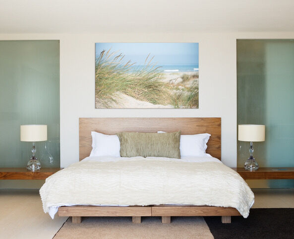



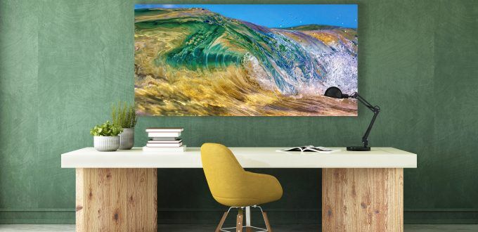
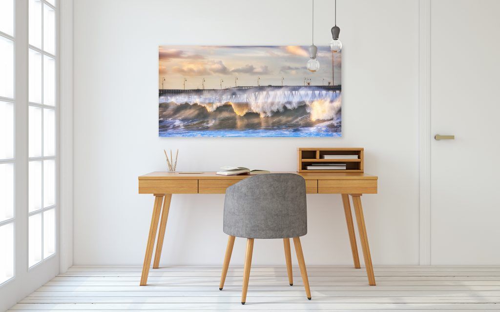
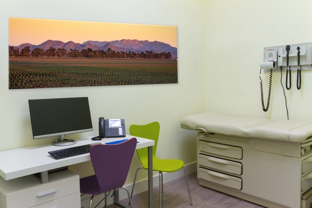
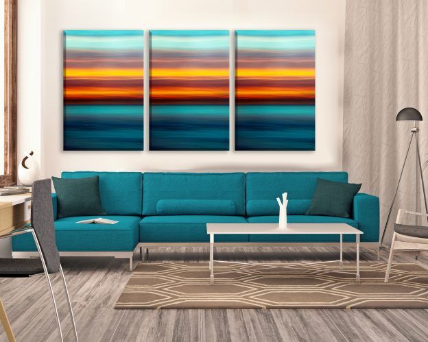
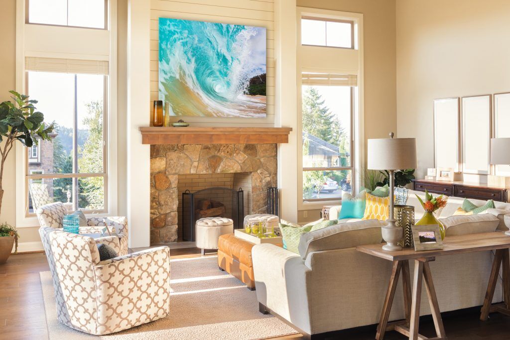
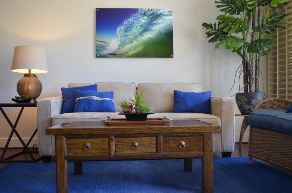


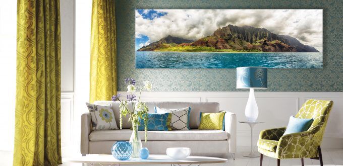
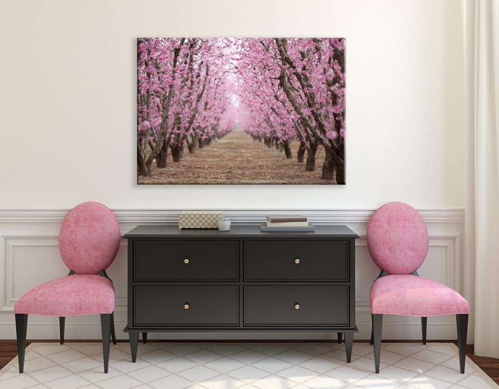
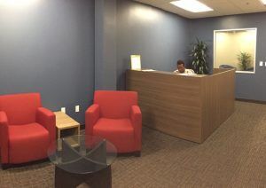

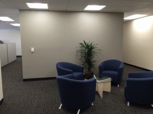

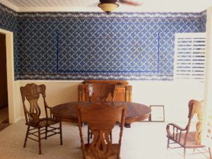
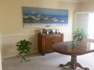
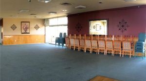
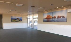 This commercial multi-purpose space needed artwork to represent our community and fill the massive amount of empty space. “Inspiration Point” and “Anacapa Sunrise” provide a soothing backdrop for any activity. The paint color changes were suggested to enhance the art and the energy of the room.
 I was immediately enamored with their powerful beauty and playful curiosity. This ancient breed of horses are semi wild but cared for by the guardians (cowboys) who dedicate their lives to these amazing creatures. It was so special to observe the relationships between the horses and also the bonds with the guardians.


 After galloping through the water they would take breaks by playfully rolling in the sand, or soaking up the sunshine as the salt water dried on their glistening coats. Other more curious horses would come up close, nudging for a scratch or give us a little nibble. They are known for their intelligence, agility and stamina.
 There were lots of foals… ready and eager to get in on the fun. The babies are born a darker color and lighten as they get older.
 Being marshland, it was best to dress for deep water so we could get in close. One misstep and that would be the end of my camera gear.


 This guy had a sense of humor and enjoyed sneaking up and tugging on my scarf when I wasn’t watching!