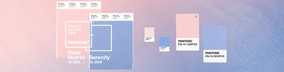
Pantone Color of the Year -Your Color Rich Life-
It is a new year and already it is flying by. This year the Latitudes Family is focusing on slowing down and savoring the moments. Stephanie is getting more time exploring new and old favorite locations to photograph, Steve is finding adventure and wonder in Kauai, and I am focusing on meeting our customer’s design needs. This includes stopping to savor the gratitude, surrounding ourselves with beauty, and soaking in all of it. So we were excited that for the first time ever, Pantone, the color experts, are predicting two “colors of the year”. More color to love! Have you ever noticed how color seems to go in cycles? A number of years ago that fresh spring green was everywhere, then for awhile it was aqua, then neon. From shoes, to clothes, to pillows and home decor, you can’t seem to escape it. Pantone’s Color of the Year is not only a prediction of what trends are going to pop up in your local stores and boutiques, but also a “color snapshot of what we see taking place in our culture, that serves as an expression of a mood and an attitude.”- Pantone
” a color snapshot of what we see taking place in our culture, that serves as an expression of a mood and an attitude.” -Pantone
We are all seeking something with this new year. Maybe it is hope, adventure, certainty, freedom or just a little peace. The color of the year captures what we are feeling and represents it with color. It gives us a starting place to dive deep into the beauty and richness of life and surround ourselves with our emotions.
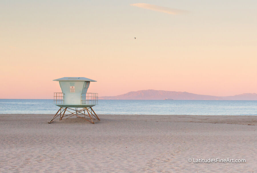
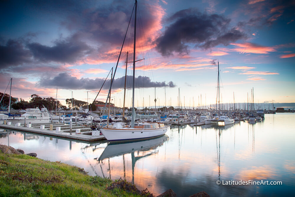
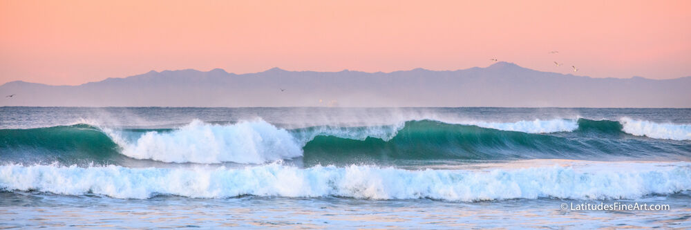
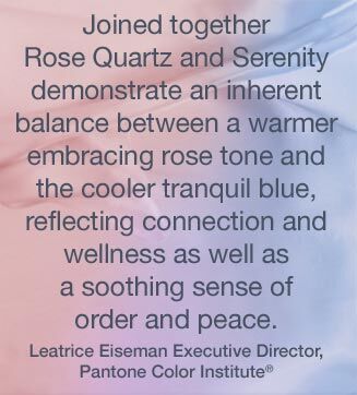
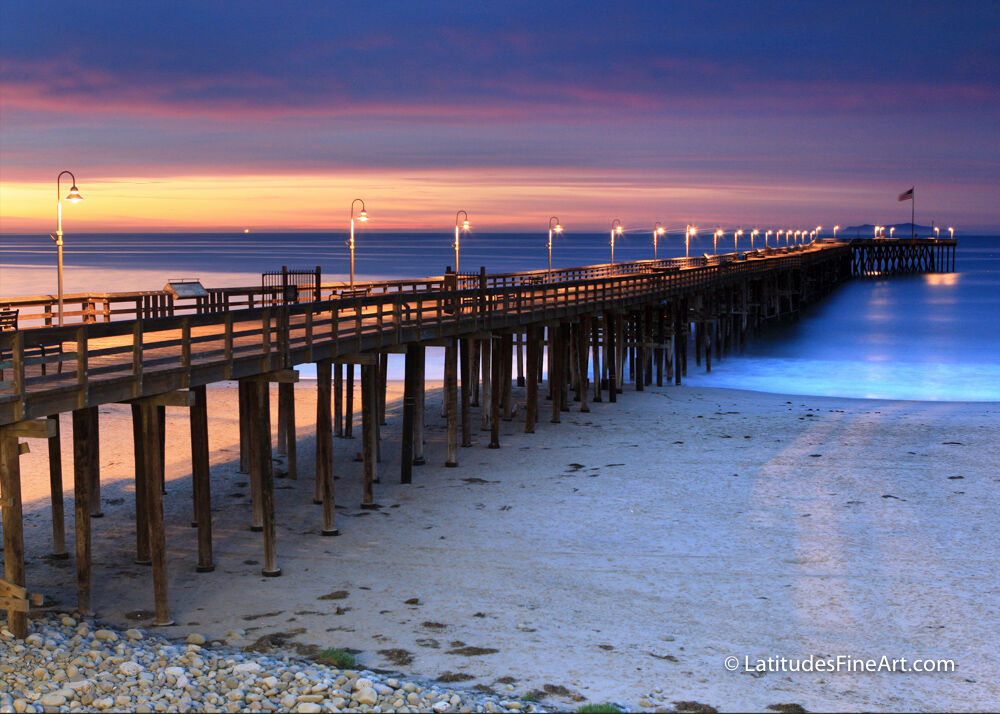
“Rose Quartz is a persuasive yet gentle tone that conveys compassion and a sense of composure. Serenity is weightless and airy, like the expanse of the blue sky above us, bringing feelings of respite and relaxation even in turbulent times.” -Pantone
 You might be wondering how to express your emotions through your space. A lot of people go through life and don’t realize the influence that our surroundings have on us. How the pile of laundry screams out every time we walk by, or the physical clutter that also clutters our minds, or the artwork on our walls that never truly represented what we needed it to. Sure you can walk past that stuff and pretend it doesn’t exist, but energetically it does. It affects on us every single time we walk by. Your artwork fills your space with energy. What is it saying? Each room has a different energetic and emotional need for each person. You don’t want to put an intense, high-energy piece of art in your bedroom, if that is your place of solace. Nor do you want a peaceful, relaxing piece in your office if what you really need is to pump up and produce results.
So take stock of your life, look at your surroundings and take this new year as a new opportunity to live rich with color and emotion, and step into your authentic life.
We will be highlighting Color of the Year- coordinating images during our First Friday Exhibit at our gallery this Friday, February 5th, 2016.
 Tasha Cleaveland is Latitudes Fine Art Gallery’s Manager and Design Consultant. She has been working with Stephanie and Steve since 2014 and is always excited to help Latitudes customers find the perfect piece to transform their space.